On 28th November, we partnered with Bramley Baths and Yorkshire Life Aquatic to present the “Mermaid Tales” exhibition, which was an interactive performance and exhibition.
This event which was funded by the Arts council and Heritage lottery, put on a dazzling and immersive evening.
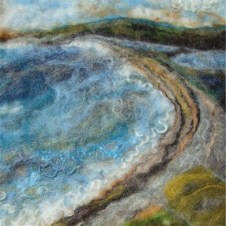
Sally Peppered is an artist who work with felt, creating pieces that are also made from wool, cotton, silk and other plant fibres. Pepperell produces these by hand, in her studio.
With the felt fibres, she builds up blocks of colour and then adds different layers as well as details, to produce landscapes and seascapes that are based on the shapes and textures from her local scenery.
I love how the fibres have been layered, in order to create these striking effects. As the fibres are so fine, I am fascinated by how they just gently bleed together, to create that water-like appearance. Furthermore, I think that it makes the scenes look really over-dramatic because they are these clash of shades and all these intricate details, that make them look really appealing and interesting.
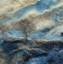
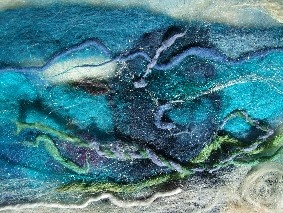
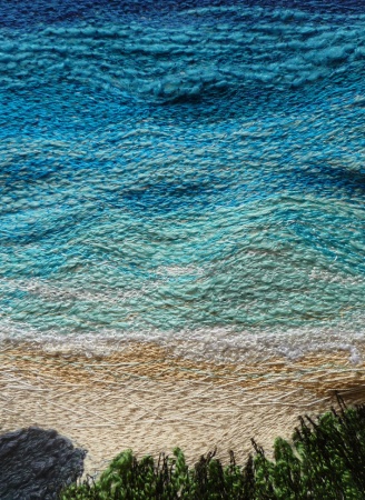
Carol Naylor
Carol Naylor trained at Goldsmiths School of Art where she gained a BA and Postgraduate Diploma in Textile Art, specialising in embroidery.
This scene looks really tranquil and calming to look it. The layered stitching adds texture to the piece and the blending of the different shades, captures the surface appearance of the water.
This post will primarily be focusing on the creation and development of my final piece that was exhibited at the “Mermaid Tales” exhibition at Bramley Baths on 28th November 2015.
When I was given the brief, I was really unsure about what direction I wanted to go down. As a group, we went on a visit to Bramley Baths, one evening to have a look at the space, which I found really helpful. As we had limited time to work on our final piece, we were advised to try and stick to a simplistic idea.
In the end, I came up with the idea of a swimming pool and capturing it being used by the different generations, from young children to the elderly. I had a group crit, so I was able to share my design, which was really beneficial as the feedback helped with the further development of my idea. Everyone really liked my design (see sketchbook) and the use of colour in the swimming pool. As well as that, they liked my illustration of the swimmer as it stood out against the backdrop of the water, as I added a white border around the figure which made it look eye-catching. I was really pleased with my illustration but I was unsure on which direction to take it. First of all, I suggested about refining the image, then editing it Illustrator before getting it printed on high-quality paper. Then, I also considered creating the whole piece out of paper. Furthermore, I mentioned in the crit, that I could possibly create it out of felt, to which everyone enthusiastically told me that it would be a good idea.
Felt
My swimming pool is the main feature in my final outcome, so it was important that it had look appealing. I found that this was one of the most difficult challenges in the project, as it was really difficult at first, to try and capture the appearance of the water with the felt.
Using small sheets of felt, I experimented creating a small version of my final piece…
In my first experiment with the felt, I cut out irregular shapes and then used the sewing machine to sew over the design. Also, the white thread made it look more distinctive as it broke off sections of the piece. Furthermore, it also added some fluidity to the water and created movement.
Feedback:
Abandon the dark shade of blue and try and stick to three shades? – I agreed because it was too dark and it did not create an overall realistic appearance of the water and thus I found it to look ‘patchy’ and unrealistic.
Try and explore an alternative way of sticking the felt together – fabric glue?
In my second attempt, I tried to focus more on the movement of water.
This was more simplistic to the previous design. Though, it did not look really textured or eye-catching. Furthermore, I did some research into David Hockney’s famous swimming pool paintings, which I took influence from. I then combined this with my own ideas, where I drew out some designs in my sketchbook (see sketchbook).
In my final attempt, I finally settled on an ideal design that captured the surface of the water. Only issue that did arise is that I drew onto the felt with a black pen and then cut the shapes out. Unfortunately, the ink seeped through the felt and the glue made it even worse. Looking back, I am glad that it happened at this stage and not when I began creating the final outcome. Otherwise, it would have had a large impact on the the presentation of my work, as you can see.
In the end, I decided that I would choose four shades of blue (see image – I used all three colours except the dark blue, which did not blend with the rest of the shades. I swapped this for a baby blue, which was more appropriate and softer).
Making my final piece
Finally, I managed to create an ideal design for my final piece (see above). I drew out a large template to cut out the pieces of felt, which I found really helpful in structuring my piece. Despite the fact, it was rather time-consuming to cut out the shapes, as I used fabric scissors, I took my time and remained patient. In the end, I was really pleased with the appearance. I went to the haberdashery in Leeds market enquired about getting a strong adhesive. I was advised to use ‘Copydex’ which did the trick! You glue both sides of the surface and then let them dry for 15 – 20 minutes before bringing each piece together. Afterwards, the felt was securely together and the overall appearance of my work looked sharp and presentable.
I further developed my design by introducing stitching to my felt. This added textured but also emphasised the colours along with the shapes. More importantly, it showed the light reflection on the water and added movement and demonstrated the general frothiness of the water, as people swim, splash and meander through the water. I am really glad that I added stitching, especially different shades as the added detail made my piece look more striking and exciting.
I wanted my work to be able to interact with the audience. Therefore, I thought about backing the illustration with the hook side of the velcro, so it could then be attached to the felt. As well as that, the audience could then become involved in the piece, as they would be able to play around with it and move the illustrations around.
However, it was then pointed out to me that velcro may be quite difficult to use as there could be the risk of the velcro pulling away sections of my felt, therefore disturbing and affecting the layout of my design. I then had to consider an alternative and it was suggested that I could back my design with metal and then attach magnets to my illustrations!
Metal
I took my piece of felt and measured it out on a piece of steel, which Leon then cut out to the appropriate size. I must admit, I measured out my felt pieces as accurately as I could but after putting all the parts together, the sides were not absolutely even, so it took a couple of attempts to cut the metal to the best size!
I then asked Leon to drill four holes at the top and then two at the bottom, as the aim was to hang my piece with fishing wire. When he drilled the metal to create the holes, they became sharp but luckily, he was able to file them over to make them smoother and prevent the wire from snapping.
When I mentioned that I was using fishing wire, he said that the fishing wire may snap due to the weight of the metal. At this point, I became really worried as I had not thought about whether the fishing wire would be able to hold the metal. Though, before I went home, I decided to hang the pieces metal up with fishing wire at the bottom of the stairs. I would then come back the next day and see if it was still hanging!
I was relieved to come back the next day to see that the metal was indeed, still hanging.
At this point, I was slightly concerned about the shape of the metal as it was slightly bent. Though, I was told that after drilling in the holes, it would bend the metal. Overall, it was not a major issue but I think it would have been easier to work with had it been straighter.
Shrinking plastic
Originally, I was going to draw out the outline of my swimmers on Illustrator and then take the design to the laser cutter, where I would then cut out the shapes and then draw and paint on my design. However, we had limited time on the project and I had been focusing a lot of my time on the felt.
I decided to look into shrinking plastic as I was able to fit it in my own time and as I was focusing on something else, this was just genuinely a lot easier to work with. For this process, you draw normally on the rough side of the plastic (pencil or a black fine marker) and then you lightly and evenly colour in the image with colouring pencils. You have to draw your design out quite big, as when it is eventually baked, it shrinks seven times smaller and is seven times thicker. Moreover, when you get to the stage of cutting it out, you must leave a small border around it.
I was really excited about seeing the final outcome of my illustrations when they had shrunk down in the oven! It was really exciting to watch them curl and twist out of shape and then settle down into their new, thicker form.
Overall, I was really pleased with how my illustrations had turned out. I then applied super glue to the back and fixed neodymium magnets.
From the project, I have a spare pack of ‘Shrinkles’ (shrinking plastic brand that I used) which I am really looking forward to experimenting with.
It was important for me to capture the different generations, through my illustrations and I enjoyed conjuring up different characters to feature in my work.
The most challenging part for me was getting the right scale and size, when doing my illustrations. I was doing my drawings at different angles and I struggled to get the right accuracy when I was filling the page with each design. I did slightly bother me that the illustrations were not even sizes, though I saw this as something interesting.
I did not necessarily see it as this way before but my piece is a bird’s eye view of a swimming pool. Therefore, people will see the swimmers at different perspectives when they view it.
My exhibition piece
For the exhibition, we had boxes made in woodwork – we then painted these and I added hooks that I purchased from Wilko to the top and bottom, that I could add the fishing wire to. The lights were dimmed around the pool, so we all added LED lights to our boxes, to add more light.
Overall, I was really happy with how my piece turned out. As I have already mentioned, there were a few issues during the whole making process, though I managed to overcome these.
Katie, Ophélie, Amelia, Jess, Evie (myself), Franzi, Elise and Char (and Katie who is not in the photo) enjoyed the trip!
On 30th November, some of my course mates and myself, went to London to see “The World Goes Pop” exhibition at the Tate Modern and the Ai Weiwei exhibition at the Royal Academy of Arts.
On arriving in London, we quickly grabbed some lunch and then made our way to the Tate Modern to “The World Goes Pop” exhibition (17th September 2015 – 24th January 2016).
“From Latin America to Asia, and from Europe to the Middle East, this explosive exhibition connects the dots between art produced around the world during the 1960s and 1970s, showing how different cultures and countries responded to the movement.”
“This exhibition will reveal how pop was never just a celebration of western consumer culture, but was often a subversive international language of protest – a language that is more relevant today than ever.”
– Tate Modern on “The World Goes Pop” exhibition.
I could not wait to go and visit this exhibition, as it was bursting with eye-popping colours and excitement. In a way, walking around the exhibition reminded me of being in a confectioners as the walls were painted these bright, sickly colours and there were all these fascinating and obscure art works.
I did not take any photographs at the exhibition but this is taken from one of the rooms.
We then went to the Ai Weiwei exhibition at the Royal Academy of Arts, which I found very fascinating and powerful.
I throughly enjoyed the exhibition but I never fully got round to properly seeing some of his spectacular works in full, as the exhibition was so busy.
From the exhibition, one of my favourite works was “Straight, 2008 – 12” which is a two hundred tonne installation consisting of steel rebars. This significant piece represents the lives of the students who tragically perished in the Sichuan earthquake on 12th May 2008. This horrific earthquake measured 8.0 on the richter scale and resulted in over ninety thousand people dead or missing, with another eleven million made homeless.
I found this piece extremely harrowing.
Craftsmen were employed by Ai Weiwei to heat and then straighten each piece of steel that was badly twisted in the tragedy, by restoring them manually to their original condition prior to the unfortunate event.
The Vaccines are an indie band who formed in West London, by Justin Young (lead singer and guitarist), Freddie Cowan (lead guitarist and vocals) (whose brother, Tom Cowan, plays synths in my favourite band, The Horrors), Árni Árnason (bassist and vocals) and Pete Robertson (drums and vocals).
Their first album, “What Did You Expect From The Vaccines?” came out in 2011, when I was fifteen. That year they came to Leeds though, unfortunately, they had sold out by the time I had hear all about it. In 2012, they released “Come of Age” and then in May this year, the third album “English Graffiti” was released.
As part of the annual, “Live at Leeds” festival, The Vaccines played Millennium Square in 2013 but unfortunately, I missed the chance to see them again as I was away for the weekend.
After that, I was wondering if I would ever get to the opportunity to see them; but I was extremely happy when it was announced that they would be playing the O2 Academy on the 29th November 2015.
I had a fantastic evening and they lived up to my expectations by playing songs from all three albums! Furthermore, I hope that I will get the opportunity to see them again in the near future because I loved every minute of that night and I left beaming with happiness over the fact, that I had finally got to see a band that I have loved since my early teens!


 I was really excited about seeing the final outcome of my illustrations when they had shrunk down in the oven! It was really exciting to watch them curl and twist out of shape and then settle down into their new, thicker form.


